Code Charley: Your Partner for Mobile-Optimized Software Solutions

Mortgage professionals, including loan officers and processors, are constantly on the move, whether meeting with clients, reviewing documents, or managing loan processes remotely. As a result, they rely heavily on mobile devices to access information, communicate with clients, and manage workflows. In such a fast-paced environment, software that isn’t mobile-responsive can lead to frustration, inefficiencies, and even lost business opportunities.

Mortgage professionals, including loan officers and processors, are constantly on the move, whether meeting with clients, reviewing documents, or managing loan processes remotely. As a result, they rely heavily on mobile devices to access information, communicate with clients, and manage workflows. In such a fast-paced environment, software that isn’t mobile-responsive can lead to frustration, inefficiencies, and even lost business opportunities.
Key benefits of mobile responsiveness in mortgage software include:
Improved Productivity
With a mobile-responsive app, users can access key features, client data, and loan status updates from anywhere, at any time. Whether they’re in the office or meeting clients at a coffee shop, mortgage professionals need full functionality on their mobile devices to remain productive.
Enhanced User Experience
A seamless, intuitive interface across all devices ensures that users don’t have to adjust to different layouts or navigation structures. Consistent design and smooth performance on mobile and desktop lead to a more satisfying user experience and increased user engagement.
Faster Response Times
Mobile responsiveness allows users to complete tasks quickly, whether it’s responding to client queries, reviewing loan applications, or sending documents. This speed is vital in the mortgage industry, where timely responses can make or break deals.
Future-Proofing
As mobile usage continues to grow, having a responsive app ensures that the software remains competitive in a mobile-first world. This responsiveness not only improves the current user experience but also future-proofs the app for evolving technology and user expectations.

Responsive Design Framework

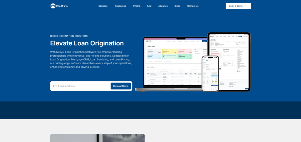
We began by leveraging a responsive design framework to ensure that the app would adapt to various screen sizes and orientations. Whether users were accessing the platform on a smartphone, tablet, or desktop, the layout dynamically adjusted, providing an optimized viewing experience.

  • Fluid Grid Layouts: We implemented a fluid grid layout that allowed the app’s elements to resize and rearrange automatically based on the screen size.
  • Flexible Images and Media: Images and other media were made responsive, ensuring that they scaled appropriately across devices without slowing down performance.
  • Breakpoints for Different Devices: We set breakpoints for different screen sizes, allowing us to tailor the app’s layout specifically for mobile, tablet, and desktop users.

Mobile-First Development Approach

We followed a mobile-first development approach, meaning that the app was initially designed with mobile users in mind. This strategy ensures that the core features and user flows are optimized for mobile devices, while additional features for desktop users are layered on top of this foundation.

  • Streamlined User Flows: Mobile users need to complete tasks quickly and efficiently. We designed simplified, intuitive user flows that allowed mortgage professionals to navigate the app and accomplish tasks with minimal effort.
  • Touch-Friendly Interactions: We optimized interactions for mobile, ensuring that buttons and touch targets were appropriately sized and easy to interact with on smaller screens.

Mobile devices often have limited bandwidth and processing power compared to desktops, so optimizing performance for mobile was crucial. We focused on several key areas to ensure fast load times and smooth performance, even on slower networks:

  • Minimizing Load Times: By compressing assets, optimizing code, and implementing lazy loading, we significantly reduced load times on mobile devices.
  • Efficient Data Handling: We implemented strategies like data caching and prefetching to ensure that users could access information quickly without excessive data usage.
  • Progressive Web App (PWA) Capabilities: To enhance mobile performance, we integrated PWA features into the Nexys app, allowing users to access the app offline and receive push notifications even when not actively using the app.

Testing Across Devices

Thorough testing was a critical part of the process. We rigorously tested the Nexys app across a wide range of devices, operating systems, and screen sizes to ensure consistent performance. This included:

  • Cross-Browser Testing: Ensuring the app functioned properly on popular browsers (Chrome, Safari, Firefox) across both desktop and mobile.
  • Device-Specific Testing: Testing the app on various smartphones and tablets to identify and resolve any device-specific issues.
  • User Testing: Gathering feedback from actual users to identify potential pain points in the mobile experience and make improvements.

Thanks to our focus on mobile responsiveness, the Nexys app now offers a seamless experience across all devices. Mortgage professionals can manage their CRM, loan origination, and servicing workflows from their smartphones, tablets, or desktops with ease, boosting productivity and enhancing overall satisfaction. The responsive design also ensures that as new devices and screen sizes emerge, the app will continue to deliver a consistent and optimized experience.

Leave a Reply

Your email address will not be published. Required fields are marked *